Friday, 26 November 2010

Final Music Video Complete - Ed Sheeran

Final Website - Ed Sheeran

Final Website - Ed Sheeran


The final website I have produced I think looks very professional and usable and contains everything the artist might want on the homepage. I have set one design and used it on all the other pages to create a similar layout throughout the whole website. However as we only had to create a homepage there is no detail on the other pages and there is only detail on the homepage.

The colour scheme of the website looks good and keeps with the artists previous colour scheme and the logo the artist uses. This consists of Orange and Black colours, and i have used a white texts to allow any writing on the site to stand out and make it easy for all people to read. The logo is used in the top right hand corner as it allows fort the identity of the artist to be easily identifiable.

The layout makes the website easy to move around in and maximises the artists potential by showing the video in the centre along with a animated GIF of the artist and a itunes sale area to show users that you can buy his songs online. There is buttons on the top of the page below the artists name and this is made so no matter if you scroll the page down the buttons are always accessible.

The media on the website includes the video in the middle that is available to watch and the artists song also plays automatically when the website opens. There are various images of the Artists being represented and there is a ipod image showing the song being played.

Overall i think that the website i have created looks extremely good and professional looking and I would happily use this as a proper website. The layout and colour scheme look good and allow users to easily navigate the site allowing the artist to gain maximum recognition.

Digi-Pack Final - Ed Sheeran

Digi-Pack Final

(Please Click The Image For The Full Better Quality Version)
This is the final Digipack Cover, this is the outside of the pack, The right hand side of the image is the front cover, the middle section is the back part and the left is the flap that folds into the Section. The images i have used show the artist well and make it stand out and look very professional. I decided to keep the Artists logo on the back of the pack to allow people to recognise it instantly when they turn over and also to keep the artists identity as he has his logo on all his products. The Text i have used keeps a clean crisp professional looking style and the front cover makes the Cover look Clean and Fresh using a shaded font for effect. The back image is edited to bring out the bright colours and light to create a very good looking back image that looks crisp and clean.

(Please Click The Image For The Full Better Quality Version)

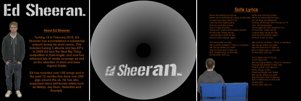
This is the inside cover of the digi-pack, the left hand screen shows the image of the artist walking away and the lyrics of the song we have made a video for. The middle centre will be the CD holding area and this is created so it looks like leaves are around the CD. The right hand side of the inside section is a picture of the artist and has a short description about the artist and his work. I chose this layout because it worked well and the images looked very professional and the colours used look very crisp and sharp. Overall i think the layout works well and it fits in with the artist and his music genre.

Final Music Video Draft 1 - Ed Sheeran

Final Music Video - Ed Sheeran "Sofa"


This is the final music video draft me and Oliver created for Ed Sheeran - "Sofa", I am very happy with what we have achieved and how the final video looks, I think that it looks very good and fits well with the music that we have chosen to use.

I think that the underling storyline of the music video is good and fits in with what the artists is trying to say in the song, and we have tried to portray what the artists is saying throughout the way we have filmed and what we have filmed. We have use many close ups and midshots to allow a the artists to be one of the main features of the video this allows more people to recognise him and his music if they see him in any other media types.

We have used locations to try and fit in with the music video and did this to the best of our abilities trying to get the mise-en-scene correct to make the most professional looking music video we could do. We also tried to use clothes that the artists wears everyday, this included, jeans and a hoodie. We wanted to keep to how the artists looks and acts as much as we can as this is our intentions to create a good looking video for the artists. We wanted the video to be based around how he would like it and what he would want it to look like.

However we are going to be improving on this video as we have gather feedback from the target audience range and they have opened our eyes to some aspects that need tweaking and changing so we shall be making these improvements in the next couple of days. When these have been done we shall upload the video again to the final version that we are submitting.

Thursday, 25 November 2010

Final Location

Final Location


The above pictures are the wooded area that we will be filming the main part of the video, these offer quite a secluded location, as it has lots of trees around it and the leaves on the floor make it look very untouched by people. We shall use these shots for singing and some running shots in the video.


We will be using this area for the song where the lyrics are about a "camp-fire" as this looks like there should be one there, however due to health and safety reasons we could not obtain permission to carry out a controlled fire in the wooded area and we have to leave the camp-fire out when we were filming the section.


Friday, 22 October 2010

Draft: Website

Draft: Website


I created the website the way it is to maximize artist publicity and create a easy user enviroment.I created it so that the song chosen automatically plays on loading of the website and there are images of the artist near a brief description of what he is doing. The video will be in the centre of the screen once finished and will play once clicked so not to intrude on the automatic playing music. I have also put social networking images to the artisit pages and also a news letter sign in page to maximise the amout of people who know about the new stuff the artisit is/will be bringing out. The colour scheme is representertive of that of the artist logo.


Draft: Digi-Pack

Draft: Digi-Pack

We each decided to create our own draft digi pack allowing us both to have total freedom of how we wanted and though the digipack should look like in our own views. There fore i used the standard digipack layout of 3 pannels on the outise and 3 on the inside pannels of the CD Digipack. The Outside layout is shown below (Click For A High Quality Image).


I decided on this layout as it is very easy to notice the Artisits logo, which allows people to easily recognise that it is the artists new CD. I chose to use the back of the artist as the background image and then but the CD song list over the top of his body as i thought this looked a good effect and was very dramatic. On the final area of the cd Outside cover, i decided to have half the artists face and body on display as a cool efefect and gave a thankyou to anyone who brought the digi-pack, as well as all the legal infomation about the songs and didi-pack.


The inside cover is shown below (Click For A High Quality Image).

The inside cover has a large shot of the artists (played by me) and a bit about the actual artist and what he is doing. There is then the CD holder and this is in the centre of the digi-pack for maximum protection. On the left of the CD will be the Lyrics to the song we are creating the music video for "Sofa" and a picture of the artist on a sofa faceing away from the viewers.

This is only our draft edit and in the coming weeks i will be improving the CD cover and creating my final version of it which will look alot better than the one shown above.

Friday, 24 September 2010

Mock Design - CD

This is the mock up CD pack Oliver created whilst I created the mock website design:

When it comes to creating the real digipack, the cover, back and inside booklet will all be photographs of Adam (signer/main character) with sofa and guitar taken on a green screen so the background can be edited


This is the mock cover for the CD. Oliver decided to use the name of the song and theme of the video, having the lead character (singer) sat on the 'sofa' with his guitar next to him.


This is the back of the CD case. Oliver chose to make it the back view of the singer sat on the sofa as it makes it clear that this is the back of the digipack and this has been used in many CD covers before. The track listing will be wrote on the back on the sofa.


This is the booklet inside the CD case. Oliver chose to keep to the theme of the signer and his guitar. There is also a list of thankyou's that will be included on the booklet.


This is the CD holder of the digipack. Oliver decided to make it look like the hole in an acoustic guitar as it keeps to the theme of acoustic music.

Mock Design - Website


This is the mock Design for the website I decided to have the name of the artists and there paw print logo to be shown at the top as it makes them easily recognisable, and guests on the website know who it is straight away.

The link bars will be under the title and logo section, with a border either side, this allows space for fine artwork either side of the section, the video will be directly below then, but thinner, this allows for more space either side where either art work or advertisements will be placed ( More Likely Artwork).

Underneath this will be two sections, on the left will be an information bit about Ed Sheeran, and on the left hand side will be 2 picture sections. one will be advertising the CD and the other will be a GIF showing different pictures of Ed during his live and TV performances.

Artist Research - Ed Sheeran

Ed Sheeran


Turning 19 in February 2010, Ed Sheeran has accomplished a substantial amount during his short career. This includes having 3 albums and two EP's. In 2008 Ed won the Next Big Thing competition in East Anglia, and now has attracted lots of media coverage as well as the attention of drum and bass legend Goldie.

Ed has recorded over 100 songs and in the past 12 months has done over 250 gigs around the UK. He has also supported many well known artists such as Nizlopi, Jay Sean, Noisettes and Example.


He Describes his sounds as "acoustic with hip hop and soul, and getting people to think about the lyrics"

Track Permission - Ed Sheeran

When we were trying to get music, we split up and sent emails to different artists, I got reply s from hoosiers and twin Atlantic, however we decided not to use these artists as they were already quite big. We decided to use the song by Ed Sheeran, as Oliver sent an email to his website.

It asked if he could use one of his songs off of his 'Loose Change EP' and got a reply back from his mum who helps him run the website. This is the reply:

Dear Ollie

I have forwarded your request on to Ed. In principle, I don't think Ed will have any objections, though it would be nice if you could show him what you do and maybe give him an idea of what you're planning. Thanks for asking and good luck.

Imogen (Ed's mum)

Imogen Lock, Director, Sheeran Lock Ltd

Filming Schedule

We have from the 11th of October to the 22nd giving us 11 days to film all the sections. We would film the piece in different sections this being chosen by the location they are being filmed in and what time we are trying to make the piece look like it is.

The outside shots will be recorded first during the day, this will include all the sofa shots with him sitting outside and the women, him walking around laying the guitar and running back to the house.We will use approximately 3-4 days to record all of these shots depending on weather.

The Morning shots will be shot the filmed next along with the night shots on the same day, these will include the shots round the fire and him falling asleep and waking up as well as at the begging on the sofa. These shots will take approximately 2 days to film, but we may need more if weather conditions are not good for the fire seen.

The inside shots will be done either last or if we cannot film any other shots due to weather as these are done inside and can be done under any weather conditions.These should only take 1 day, but no more than 2.

The days we have spare will be used up by looking at the shots we have taken and adding any extra footage we think we need to link the scenes together better.

Risk Assessment

This is the risk assessment that Oliver has created while I created the filming schedule.

Camera gets wet – could cause electrocution or other dangers - Try to shelter the camera if the weather is starting to look bad, as it is electrical and could cause serious safety problems.

Injury whilst carrying the sofa – could hurt back or slip and fall - If it is too heavy to carry, get more people to help so it reduces the strain. Also make sure that the path you are carrying it on is clear so there is nothing to fall over.

Burned by the fire - Always stay a safe distance away from the fire when filming or when off camera. Keep flammable objects away and to the minimum.

Inhale fumes from the fire - Make sure that nothing being burned on the fire is toxic and try to stay away from the smoke.

Fall over whilst running through the streets - Make sure the path is clear before filming and any hazards have been removed or avoided.

Slip in the mud (if it’s been raining) - Try to avoid filming in muddy areas as falling could damage you ankles.

Dangerous objects in the grass where filming - Check the grass where filming before shooting to make sure there are no hazards hidden away that could cause damage to the actors e.g. needles

Whilst actor is walking and staring down the camera lens they could be unaware to dangers around them - Make sure the area is clear of dangers before beginning to film as the actor will not be paying attention to what is around them.

Weather - Try to avoid filming in bad weather conditions such as rain, hail, or thunder.

Poor lighting - Use extra lighting in dark scenes (campfire scene) as the actors and cameramen will not be able to see all that is around them.

Equipment being stolen - Make sure that the equipment is always in sight and try to hide it away when other people are walking past.

Other people - Try to film in places that not many people would go as they could ruin the shots and/or become a threat.

Thursday, 23 September 2010

Storyboard & Animatic

The first shot (above) is of the boy (Played by me) lieing on the sofa and the camera will be looking down on him from birds eye view shot.

Second shot is of the boy, getting up and sitting on the sofa normally, starting to sing with the lyrics.
Next the boy where he is beginning to get up, still singing the lyrics.

Next is where he gets up and grabs the guitar leaning against the sofa.

The final shot of that sections is when the boy is up and playing the guitar and singing the lyrics to the song.
The next section begins with the wide pan with everyone around the fire and the boy playing guitar to them.

It then changes to a close up of the girl who the boy likes, and then to an extreme close-up of her eye.

Lastly in this section is when they will be falling down on the ground together going to sleep.
The start of the next section is a birds-eye view mid shot of the boy on the ground without the girl.

He then picks his guitar off the ground and begins to walk.

He ends with him slowly putting the guitar over to play it at this point the chorus will be playing.

The indoor section begins with a 2 shot over the shoulder of the boy and girl sitting down, with the TV in view.

In then goes to the man making tea and this will also be an over the shoulder view.

It ends when he enters back in the room and is a shot from behind with him visible and the sofa and the girl has gone.
The next part begins with the boy running down a track, this will be a mid shot extending to a long shot.

Then a mid hot of him looking unhappy.

The a midmost of him playing the chorus on his guitar at another place.
The next scene starts with the boy running back the way he came, mid-shot to long-shot.

Then the girl sitting on the sofa outside, will be a mid to long-shot.

The boy joins her on the sofa and this will be a long to mid-shot.
The final shot will be a close up of the boy and girl sat next to each other looking happy.


Props/Location/Actors/Costume/Equiptment

These are the props that are needed for our video:

Sofa
Acoustic guitar
TV
Skateboard
Camp-fire

These are the locations needed for the video:

Living room
Kitchen
Field
Field with the sofa
Field with the fire
Streets

These are the actors/character in our video:

Adam Turner (singer/lead role)
(female love interest)
Ashley Grantham (lad around
the campfire)
Oliver Burrows (lad around the campfire)

These are the costumes for the actors:

Adam (me) - Hoody, jeans, trainers
Girl - T-shirt, jeans, pumps
Ashley - Hoody, jeans, pumps
Oliver Burrows - Shirt, jeans, pumps

This is the equipment needed for the video:

Camera
Tape
Tripod
Lights

Genre Research

The term "Indie" is often used to mean a sound that a musician presents, but when interpreted more literally, it is the way that sound is presented or made. "Indie" often refers to an artist or band that is not part of the mainstream culture and/or making music outside its influence. Though the sound of these bands may differ greatly, the "Indie" definition comes from the do-it-yourself attitude and ability to work outside large corporations.

The budget for Music videos of Indie bands is normally quite small this is due to normally not being in a big record company deal and often being unsigned or signed my a small record company specialising in there genre of music.

Conventions in Indie music videos are :
  • Tends to be black and white
  • The artist/band is shown throughout the music video
  • Use of extreme close ups and long-shots are popular
  • Dark Locations
  • Fast Paced
  • Some use of special effect
For examples see below:

Director Analysis - Michael Bay

Michael Bay


Michael Bay is an American film director and producer, his work includes high-budget action-adventure films such as Bad Boys, Armageddon, Pearl Harbour, and Transformers, have grossed over three billion dollars world-wide.

However he did not start by doing these big budget movie's, One week out of out of film school in 1989, Michael Bay began directing commercials and music videos for Propaganda Films. His works for such acts as Meat Loaf, Aerosmith, Tina Turner, Donny Osmond, and the DiVinyls won the young film-maker recognition, acclaim, and a number of MTV Video Award nominations. He won the coveted Best Music Video prize in 1992 and 1999.

Trade Mark's:

  • Intense slow motion shots of characters
  • Has the camera moving during most scenes. Very rarely uses static shots.
  • Often uses lightflashes (i.e. lightbulbs and cameraflashes) to enhance scenes.
  • Often has over-the-top visuals.
  • Often features a slow-motion shot of an object crashing into, or tumbling towards the camera.
  • Frenetic editing of action sequences.
Most of these types can be seen in the music video below ( Meat loaf "I would do anyhting for love")Directed by Michael Bay.

Questionnaire with Results and Analysis

Once the questionnaire had been completed I then analysed the results using graphs to decide what our target audience would like the video to look like so adjustments could be made to the storyboard if necessary.


This shows that the target audience believe that the video should be a mxiture of sad and happy. So the best way to do this would be to have a sad video but with a happy ending.


This shows that 70% of the traget audience would want the video to be a love video as it matches the love theme of the song.


This shows that 4 in 5 people like this song. This is good as it means that people are more likely to watch the video if the like the song it is for.


This shows that 70% of the audience do not want this video to be shot in black and white as it is not really suitable for the type of song. However the 30% that did want it in non colour means that an aspect of the video may be produce in black and white.


This shows that 90% of our audeince would listen to this style of music on a regular basis. This means that the song is right for our audience meaning that the video will most probably become more popular as people enjoy the style of music.


Saturday, 18 September 2010

Website Homepage Analysis - You Me At Six

You Me At Six


The image above shows the You Me At Six Official Website, it is laid out in 2 main columns with a title and video at the top of the page. The two columns split into sections with band iphone apps, information about members of the band and then news about what the band are currently doing or have done. this is all on the left hand side of the screen. On the right hand side of the screen is the other column, this includes an add for there latest album, and a fans post section showing what the fans have been saying to them. And below this is ways to follow the band on social networking sites, such as: my-space, facebook and twitter.

The links to other sections for the website are at the top of the page, below the title and video, these are in a good place as you don't have to scroll to find them when you enter the website and they are obvious to find and are clearly readable for everyone.

The colour scheme of the website is a green and orange theme,, this matches there latest album artwork and colour scheme as well as the way headings are shown. The masking taped You Me At Six title is shown like this on the artwork and therefore they are keeping the two styles very close so that is there identity.

The video and the pictured on the homepage help promote the bands image and songs as well as the advertising used on the site to show there newest album out. This helps the band gain recognition my the public who are more likely to know what they look like and sing now.

The design of the website bits in very well with the way there album has been created, the video and pictures to the unique and quirky feel. This is shown with the old style Polaroid type pictures and the retro games console video player. Which makes the website very unique and interesting.

Overall I think this website is extremely well presented and designed. I think that the many different media types used as well as the advertisements put into place help show off the bands well known songs and also allows visitors too see the members clearly and easily. The colour scheme of the website ties in with the bands overall look and feel making it noticeable that there album is the way it is. I also think that the way the website is split is very good as it is considerate about fans, but also updates them on what's going on.